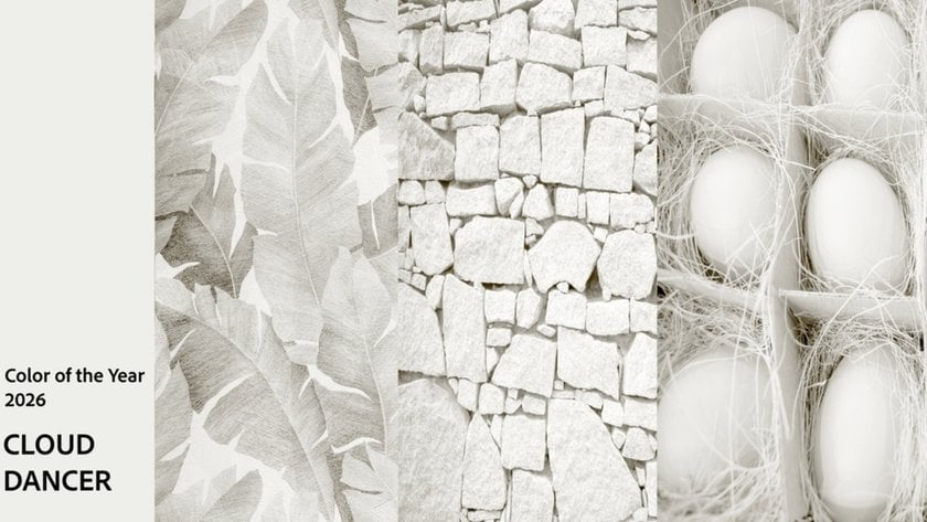
Pantone Color Of The Year 2026 "Cloud Dancer" Is Here!
December 09, 2025

Discover what is the Pantone color for 2026: Cloud Dancer, a soft balanced white symbolizing calm, clarity, and a cultural reset for the year ahead.
The world is loud. Screens glow, trends flicker, and cultural cycles spin faster than ever. And into this whirlwind, Pantone offers a counter-gesture: Cloud Dancer, a quiet shade of white chosen as the Color of the Year for 2026. Soft but not sterile, warm but not creamy, it steps away from recent trending hues like pastel pinks and light blue, returning to something more elemental.
With the Pantone Color of the Year 2026 announced, this choice lands with surprising weight—a gentle pause for a culture craving clarity, or maybe just space.
What Exactly Is Cloud Dancer?
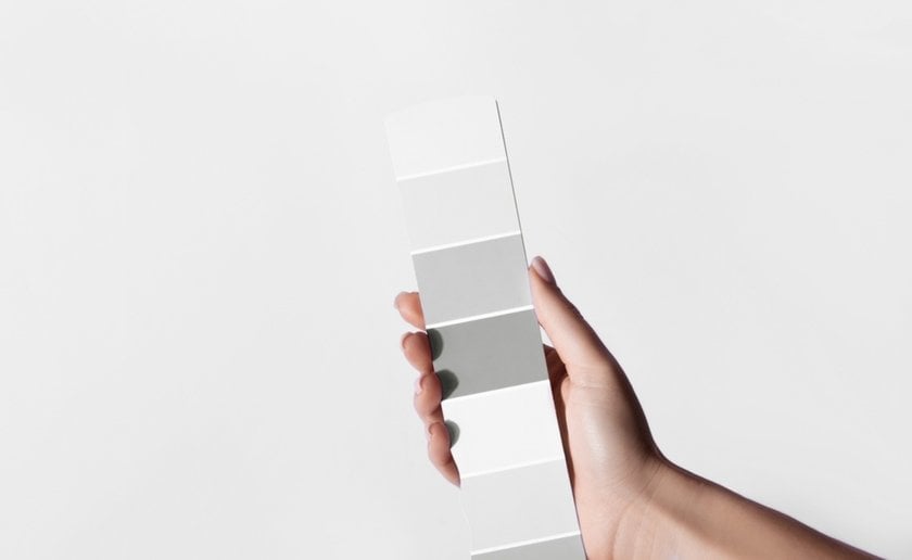
At first glance, Cloud Dancer seems simple—just white. But Pantone chose this shade with precision. For anyone wondering what is a Pantone in the first place: it’s the global color-matching system that standardizes hues across industries, ensuring that a shade like PANTONE 11-4201 looks the same in fashion, print, digital design, and beyond.
The name does half the storytelling. Cloud Dancer turns a neutral into an image—something weightless, open, and quietly expressive.
Pantone frames the shade—and the color of the year 2026 Pantone—as a reset: a “calming influence in a frenetic society” and a symbol of “new beginnings,” according to Leatrice Eiseman. In a world overwhelmed by noise, Cloud Dancer offers visual room to breathe.
Yet white is never an empty canvas. Across cultures it signals purity, mourning, luxury, simplicity. Cloud Dancer sits between these meanings—understated, but far from blank.
Match the Mood Create Stunning Color Harmony Instantly
Try Color TransferThe Cultural Moment: Why 2026 Needed a Shade of White
Pantone’s choice doesn’t exist in a vacuum. Cloud Dancer follows last year’s Pantone Color of the Year 2025, Mocha Mousse—a warm, grounded brown that dominated runways and interiors. The shift from earthy depth to airy whiteness marks a dramatic cultural reset.
And as this announcement quickly circulates through Pantone news, it becomes clear that the choice reflects more than aesthetics: it mirrors a collective desire for pause, clarity, and a reset from the visual and emotional overload of recent years.
A Culture Tired of Noise
After years of hyper-saturated aesthetics—Barbie pink, Brat green, neon everything—visual culture is showing signs of fatigue. Trends recycle faster than we can name them, and every platform feels increasingly crowded. A quiet, breathable white becomes a natural counter-move.
Advanced yet easy-to-use photo editor
Get Luminar Neo NowA Psychological Reset
Pantone describes Cloud Dancer as a color for “measured consideration and quiet reflection.” It resonates because people are craving exactly that: space. Not more stimulation, but less. Not another aesthetic wave, but a pause between waves.
Technology’s Shadow
As AI, automation, and constant connectivity blur the edges of daily life, softer, natural tones have gained appeal. Cloud Dancer feels like a human response to a world becoming a little too optimized, too fast, too frictionless.
A Blank Slate in a Stagnant Cycle
As NYT’s Jacob Gallagher pointed out, culture right now feels like “a rehash of a rehash.” The choice of white mirrors that sense of being between eras—a blank page before the next shift.
Cloud Dancer, in this reading, isn’t an answer. It’s the breath before one.
The Debate Around White: More Than an Aesthetic Choice
 Choosing white might seem safe, even neutral—but 2026 is not a neutral year. Almost immediately after Pantone’s announcement, conversations surfaced about the cultural, political, and symbolic weight the color carries. And within the broader Pantone color palette, Cloud Dancer stands out as a choice that is anything but simple.
The Political Echo
In a year defined by debates around diversity programs and rising nationalist rhetoric, a color called Cloud Dancer couldn’t escape interpretation. As Callie Holtermann noted, some viewers will inevitably connect the choice to broader social tensions. Pantone didn’t intend this, but symbolism rarely stays contained.
The Question of Elitism
Historically, white clothing signaled status—the ability to keep fabric spotless. Jacob Gallagher pointed out that white often reads as elite, aspirational, even exclusionary. Pantone’s pick could be tapping into that subconscious narrative: whitening as refinement, privilege, perfection.
A Color Full of Paradox
White isn’t actually blank. It carries contradictions depending on who’s looking:
purity and rebirth
mourning in parts of Asia
sterility in tech and medicine
minimalism in design
luxury in fashion
emptiness or erasure in social commentary
This makes Cloud Dancer both universal and contentious—a clean slate layered with centuries of meaning.
Calm or Avoidance?
Some critics see the choice as a refusal to make a bolder cultural statement, a retreat into “safe” neutrality. Others read that same neutrality as the statement itself: a culture unsure of its direction, choosing openness over certainty.
Pantone may frame Cloud Dancer as serenity, but for many, it’s a mirror of the moment’s ambiguity.
How Cloud Dancer Is Already Showing Up in Fashion and Culture
 Pantone may have only just named Cloud Dancer the Color of the Year, but the shade has quietly been shaping visual trends for months. Its influence is already visible across runways, red carpets, album aesthetics, and even Olympic uniforms.
Fashion’s Soft-White Momentum
Designers have been leaning into airy, textured whites—not stark, crisp bridal whites, but softer, more organic versions that echo Cloud Dancer’s mood.
The 2025 Met Gala: Diana Ross’s 18-foot feathered train became one of the night’s defining images, a billowy spectacle in pure white that embodied the color’s theatrical lightness.
Emma Stone in Venice: Her Louis Vuitton bubble-hem dress brought a sculptural softness that mirrors Pantone’s emphasis on “billowing” forms.
Rosalía’s Lux era: Her promotional looks featured clean white silhouettes—fluid, luminous, intentionally simple—aligning with the understated clarity Cloud Dancer represents.
It’s not minimalism for minimalism’s sake; it’s minimalism with air.
White as a National Aesthetic Moment
Ralph Lauren’s designs for Team U.S.A. at the 2026 Winter Olympics are overwhelmingly white—flannels, duffle coats, cargo pants, puffers. The choice radiates both confidence and restraint, reinforcing the idea that white is stepping into the cultural foreground.

Interiors: Soft Structure, Natural Calm
In design, Cloud Dancer fits seamlessly into the shift toward warm, tactile minimalism.
Pantone describes the shade as “clarity without coldness” and “structure without severity,” making it ideal for spaces built around natural materials—stone, wood, linen, plaster. It’s the anti-digital white: softer, grounded, human.
Homes aren’t chasing sterile futurism anymore; they’re craving quiet.
Why Now? The Deeper Logic Behind Choosing Whit
 Cloud Dancer arrives at a moment when culture feels overstimulated and strangely paused—caught between cycles, unsure of its next direction. After years of loud, hyper-saturated aesthetics, there’s a natural craving for quiet. White becomes a release valve, a palette cleanser for a world saturated with noise.
It also mirrors a broader emotional landscape. Technology accelerates faster than we can adapt, politics feel unstable, and cultural trends loop without moving forward. A shade described as a “calming influence in a frenetic society” fits this collective desire for stillness, reflection, and reset.
But white isn’t passive. It asks for intention, attention, presence. In that way, Cloud Dancer feels less like a retreat and more like preparation—the color you choose when a chapter is closing, but the next one hasn’t been written yet. It’s not optimism or pessimism; it’s possibility.
Cloud Dancer and Pantone 2026 Color Trends
 Cloud Dancer may be understated, but its influence won’t be. In fashion, this soft, balanced white is set to anchor collections built around texture rather than color—think layered fabrics, sculptural silhouettes, feathers, wool, and matte finishes that let light become the main design element. It’s a shift from statement hues to statement materials, where nuance replaces saturation.
In photography and visual design, Cloud Dancer raises the bar. White is notoriously difficult to capture and edit, forcing creators to work more intentionally with light, shadow, and detail. Tools like a color palette generator from a photo will likely become even more popular in 2026, helping artists extract subtle tonal variations from white-based images.
Elevate Your Photography with Our Advanced Software
Discover PricingInteriors will continue moving toward warm minimalism, echoing Pantone’s description of the shade as “clarity without coldness.” Expect more organic whites paired with stone, wood, linen, and architectural textures that soften digital life and bring the focus back to space and materiality.
Even digital culture may follow suit. UI and branding already trend toward softer neutrals as an antidote to the visual fatigue of neon aesthetics. Cloud Dancer fits seamlessly into this shift: calm, clean, human.
This isn’t a year of loud visuals. It’s a year of refinement—of paying attention to what remains when color steps back.
Conclusion: A Quiet Color for a Loud World
 Cloud Dancer may look like the simplest choice Pantone has made in years, but its meaning runs deeper than its softness suggests. In a moment defined by uncertainty, acceleration, and cultural saturation, this shade of white feels almost radical in its restraint. It doesn’t tell us what to feel or where to go next—it simply opens the space for possibility.
White is never truly blank. It carries history, symbolism, contradiction, and hope. By choosing it now, Pantone isn’t offering an escape from the world but a pause within it—a moment to breathe, reset, and look ahead with clearer eyes.
Cloud Dancer isn’t about absence. It’s about beginning. And perhaps that’s exactly the color 2026 needs.