iPhone Photographic Styles That Really Make A Difference
January 22, 2026

The iPhone camera does more than capture what is in front of it. With iPhone photographic styles that really make a difference, it also decides how that moment should feel from the start.
The iPhone camera has reached a point where many photos look polished straight out of the camera. This is not only about better sensors or smarter HDR. One quiet feature plays a huge role in how images feel from the first second. Photographic Styles subtly shape color, contrast, and tone before the photo is even saved. When used thoughtfully, they change how everyday moments are recorded without forcing heavy edits later.
What Photographic Styles Actually Do on iPhone
 Before choosing a style, it helps to understand what is Photographic Styles on iPhone at a practical level. They are not filters layered on top of a finished image. They work during image processing. The iPhone analyzes the scene and applies tone curves and color preferences while preserving natural skin tones.
That difference matters in real situations. A filter can flatten skin or exaggerate shadows. A photographic style adjusts contrast and warmth while keeping faces believable. This is why portraits taken with this feature still look like real people, not over-processed characters.
Styles affect three main areas:
Overall contrast and brightness
Color warmth or coolness
How shadows and highlights roll off
They do not change depth, lens choice, or framing. They simply guide how the camera interprets light and color.
How iPhone Photographic Styles Differ From Filters
 Many people confuse styles with traditional filters. The difference becomes obvious when shooting faces, food, or street scenes. Filters often apply a uniform look, which can crush details or tint skin unnaturally. Styles are adaptive.
For example, in a café portrait, a filter might turn skin orange under warm lights. A style keeps skin neutral while still warming the wood tables and ambient glow. That is why they feel more invisible. Later, if deeper edits are needed, filters for pictures can be applied without fighting heavy baked-in effects. Starting with a balanced base image always gives more flexibility.
The Most Popular iPhone Photography Styles Explained
Here are a few iPhone Photographic Styles, and each one shines for a different reason:
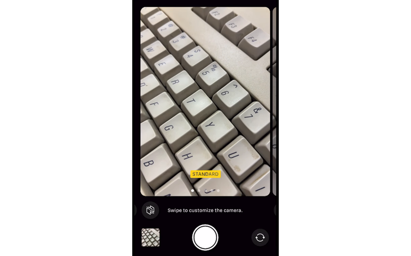
Standard: Stays neutral and consistent, so it works well if someone plans to edit later.
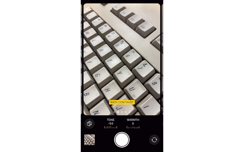
Rich Contrast: Adds depth and punch by deepening shadows, making skies darker and textures more defined. It is a strong fit for architecture and landscapes.
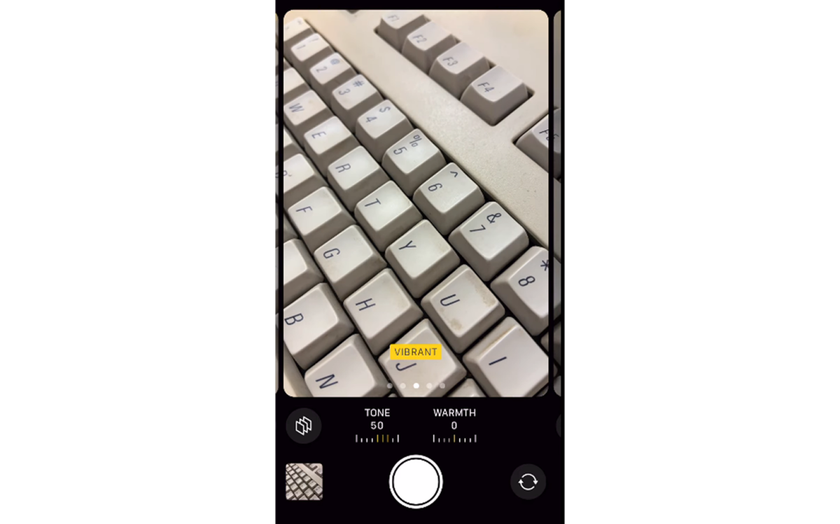
Vibrant: Boosts color without pushing skin tones too far, which makes it great for travel photos and nature scenes.
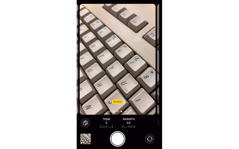
Warm: Shifts white balance toward golden tones, flattering golden-hour shots and cozy indoor scenes.
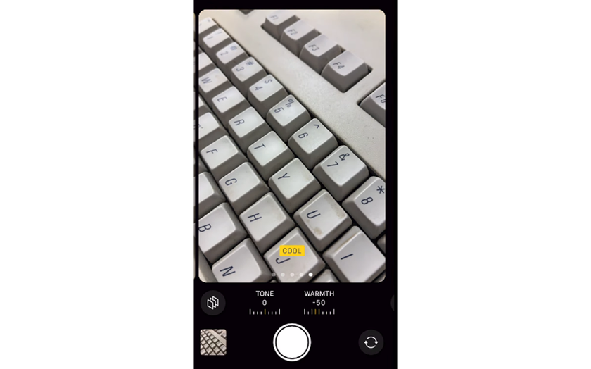
Cool: Pulls tones cooler and cleaner, working well in modern interiors and snowy environments.


None of them is the “best” for everything. The photos look strongest when the look fits the scene and the light, not when the same option is used on every shot.
How Photographic Styles Affect Skin Tones and Faces
 Photographic styles matter most when people are in the frame. Unlike filters, they are designed to protect skin tones, but each look still changes how faces are read. Standard usually keeps skin closest to real life, especially in mixed indoor lighting. Rich Contrast adds depth, but it can exaggerate shadows under the eyes and around the nose, making faces look harsher in strong light.
Vibrant boosts color while mostly keeping skin balanced, which works well outdoors. Warm light adds a healthy glow at sunset, but can turn skin too orange under warm bulbs. Cool cleans up yellow light, yet may make faces look pale in shade.
Choosing the Right Style for Everyday Scenes
 Selecting the right iPhone photo style is less about trends and more about everyday habits. A simple way to choose is to match it to what gets photographed most often.
Family moments indoors: Go for softer contrast and a touch of warmth, so skin stays natural under lamps.
City life and street scenes: Cleaner whites and stronger edges usually suit buildings, shadows, and signage.
Travel and nature: A slightly more colorful look can make greens and skies feel alive without heavy editing.
Snowy or minimalist spaces: Cooler, crisper tones often keep whites looking clean instead of yellow.
Consistency is the real secret. When most photos share a similar feel, the camera roll looks intentional instead of random.
To pick confidently, test in three quick situations:
a window-light portrait,
a cloudy outdoor scene,
and a night street shot.
That small test shows how each option behaves across lighting changes.
When Rich Contrast Makes Sense and When It Does Not
Rich Contrast often attracts attention because it makes photos look dramatic instantly. It deepens shadows and increases separation between tones. In street photography, this can highlight structure and geometry. Yet, it can be unforgiving in portraits. Fine shadows under the eyes or around the nose become more noticeable. For casual people shots, this style may feel too harsh.
A common approach is using Rich Contrast for environments and switching to a softer look for faces. This flexibility is part of the broader iPhone photo options that many users overlook in daily shooting.
Using Photographic Styles for Portraits and People
 People photography reveals the real value of this feature. Skin tone handling is the biggest test. Styles are designed to avoid shifting skin into unnatural hues.
For black-and-white portraits, a lot of photographers still shoot in color with a neutral look, then convert afterward. Tools that make photo black and white usually give more control over skin tone brightness and background separation than locking it in-camera. For color portraits, Warm ones can enhance mood, but moderation matters. Slight warmth feels inviting. Too much warmth feels artificial. Testing with real faces in different lighting is the only reliable method.
Adjusting Styles Without Overthinking Settings
 One reason styles work so well is simplicity. Instead of sliders and curves, users pick a look once and shoot freely. This reduces friction and helps focus on moments.
That said, small adjustments still help. Fine-tuning tone and warmth inside the style settings personalizes the look. This is especially useful for those who want consistent results across seasons. For deeper control after shooting, understanding the best iPhone photo edit settings helps refine contrast and color without undoing the natural base created by the style.
Combining Photographic Styles With Light Awareness
Styles cannot fix poor light: they respond to it. Understanding light direction and quality multiplies the impact of any choice. A Warm style in flat midday sun can look dull. The same one during sunset feels cinematic. Cool styles in shade emphasize calm tones but can feel lifeless indoors. Learning how light interacts with them is part of building confidence. A lot of beginners get better faster with practical iPhone photography tips, because they show that good timing and smart positioning usually matter more than tweaking settings.
How Styles Influence Editing Later
One overlooked benefit of iPhone Photographic Styles is how they shape the editing workflow from the start. Beginning with a clean, balanced image means there is rarely a need for heavy exposure fixes or strong color corrections later. When a photo already has controlled highlights and natural skin tones, edits stay light and intentional instead of corrective.
If the color mood needs a subtle shift, tools like Image Tinter can refine hues gently instead of fighting strong baked-in colors.  This keeps images flexible for different outputs, from social media to prints. Photographers who shoot frequently appreciate this efficiency because less time fixing color means more time shooting and sharing.
Finding the Best Style for Your Personal Taste
 There is no single best photographic style iPhone users should follow. What works for a sunset might look wrong indoors, so match the style to the scene.
Travel and nature photographers often gravitate toward Vibrant, because it brings out color in landscapes and city scenes.
Minimalist or everyday shooters tend to prefer Standard for its calm, neutral look and easy editing later.
People-focused photography usually benefits from softer contrast and balanced warmth.
The most important part is commitment. Using one option consistently makes its strengths and limits clear over time. A simple exercise helps: review a month of photos and note which images felt easiest to share or required the least editing. Patterns appear quickly. In most cases, the right choice reveals itself through regular use, not theory.
Your AI-Powered Photo Editor for MacOS and Windows
Discover Now!Why Photographic Styles Change How iPhone Photos Feel
Photographic Styles do not scream for attention. They quietly shape the emotional tone of images. They influence whether a photo feels cozy, sharp, calm, or energetic.
By choosing intentionally, users turn the iPhone into a more personal camera. Photos stop looking generic and start reflecting taste. That is the real difference. It’s not about chasing perfection with Styles. It’s about giving a photo a clear mood, so ordinary scenes feel more deliberate and easier to revisit later.