Balance in Photography: Master the Art of Visual Harmony
Last Updated on October 07, 2025
Learn how to achieve perfect balance in photography. Discover techniques to create visual harmony, guide the viewer’s eye, and make every composition feel natural yet captivating.
A photograph lives or dies depending on how the eye perceives it. A more subtle mechanism is at work in front of an object, color, or story — a quiet struggle that determines where our gaze falls and how long it stays there. Master this, and even simple scenes will take on sophistication; miss it, and the frame will seem restless, no matter how good the light is.
Balance in photography is in right notes and dark pauses, strong shapes and soft breaks, everything is arranged so that the viewer perceives the picture without straining their eyes, yet still feels a spark.
Today, we will learn more about photography balance and how to make it in your everyday workflow.
What Is Balance in Photography?
 The balance photography definition is the distribution of visual weight within a frame that makes an image feel stable and pleasant to the eye. It is the sense that a picture “sits” well — nothing pulls attention so strongly that the composition feels off-balance. That feeling comes from visual weight: bright areas, saturated colors, high-contrast edges, faces, sharp detail, and large shapes all pull the gaze more than muted tones, blur, or empty space. You can spread that pull evenly — through symmetry, paired subjects, or a calm horizon — or you can let one element dominate while a counter-shape, texture, or patch of negative space steadies the view.
Choosing calm or tension depends on intent. A level arrangement supports clarity, product shots, and portraits where the mood should feel settled. Letting the frame lean a little can guide the eye, add energy, or suggest motion. This is where imbalance becomes a tool rather than a mistake: an off-center subject against open space, a strong diagonal, or a small figure set against a vast background can create anticipation and story.
To add drama on purpose, place the main subject off the thirds and give it contrast to “outweigh” the rest — a bright jacket in shade, a sharp silhouette against mist, a textured foreground against a soft sky. Then offer a subtle counterpoint — a leading line, a secondary shape, or controlled negative space – so the scene feels tense yet readable.
Balance Definition in Photography vs. Composition
 Composition is the overall plan; balance is the distribution of visual weight within the frame. What is balance in photography? It means judging brightness, contrast, color, size, texture, and focus so the eye moves cleanly. There’s more than one type of balance — symmetry calms, near-symmetry feels natural, asymmetry adds energy yet keeps harmony.
In practice, balancing elements photography uses counter-shapes, leading lines, and negative space; balance is achieved by small shifts in position, light, or background until attention feels proportional. For learners, incorporate this understanding of balance in photography into your daily shooting — you’ll find that photography tips for beginners echo it: place interest clearly within the frame, so the story reads.
Types of Balance in Photography
Different scenes ask for various kinds of poise. In balance photography, you can either distribute attention evenly for calm or set up a controlled tilt for energy. The choice shapes mood, pacing, and how the eye travels — and it starts with how you place subjects, manage contrast, and guide space.
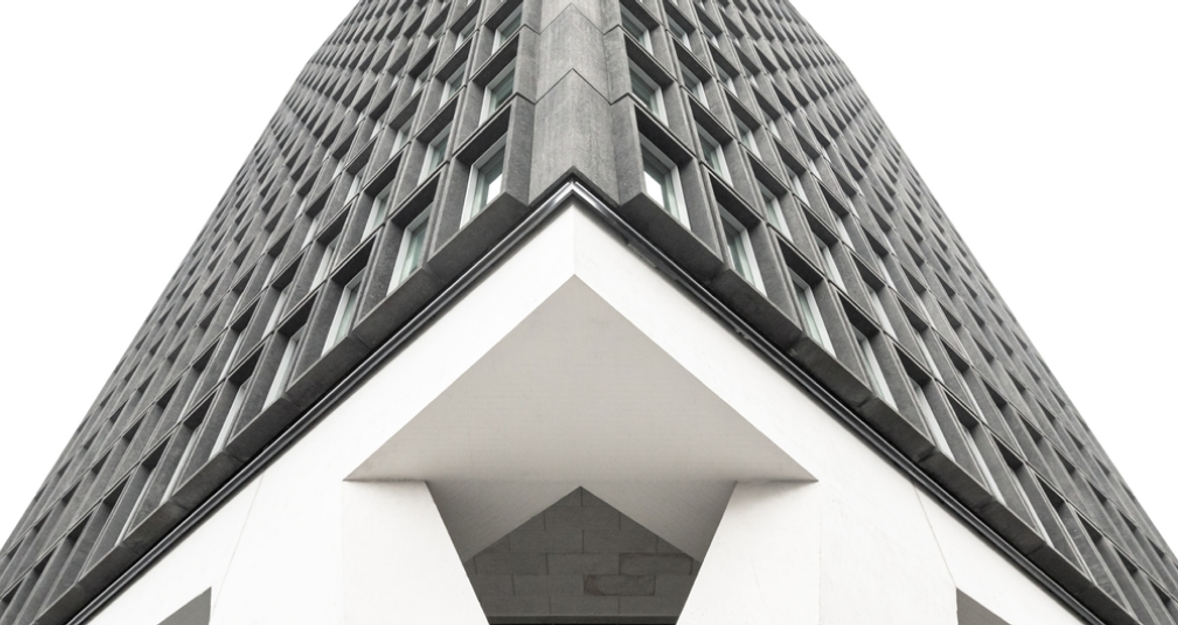
1. Symmetrical (Formal) Balance in Photography
Here, in formal balance photography, the left and right sides (or top and bottom) mirror each other, so the frame looks stable and formal. The central horizon should not be “collapsed”; on the contrary, mirrored architecture is valued. If it is a portrait, it will be centered, where both sides have the same brightness, size, and texture.
To learn how to balance the elements of a photo, observe the light and shadows on each side, then fine-tune the distance until you feel the balance. A professional photographer will always pay attention to the position of the camera — small changes in distance or angles in photography can disrupt or enhance the mirror effect. A step to the left or right corrects minor inconsistencies without moving the subject.


2. Informal Balance in Photography (Asymmetrical Balance)
What is asymmetrical balance? It’s when the visual pull isn’t equal, yet the picture still reads as harmonious because lighter counterpoints steady a strong element. In informal balance photography, a bright subject near one edge might be offset by open space, a leading line, or a smaller, darker shape across the frame. Color contrast, depth blur, and diagonals help you “trade” weight. Aim for intentional tension rather than chaos, and keep adjusting placement until your eye flows without snagging.
Formal vs Informal Balance in Photography
A quick side-by-side comparison makes choosing easier — pick the feel you want, then match the setup to the subject.
Formal (Symmetrical) | Informal (Asymmetrical) | |
Core feel | Calm, orderly, stable | Dynamic, lively, tension with harmony |
How it works | Mirrored shapes, even tones, centered subjects | Uneven visual weight offset by counterpoints (lines, space, secondary shapes) |
Strengths | Clear reading, timeless look, strong structure | Energy, depth, story emphasis, modern mood |
Risks | Can feel static or stiff | Can feel messy if offsets are weak |
Best for | Architecture, product, portraits needing neutrality | Street, lifestyle, landscapes with scale contrast |
Setup tips | Lock horizon; check edges; equalize highlights | Place the subject off-center; balance with negative space or leading lines |
When to choose | You need certainty, clarity, ritual | You want motion, focus on a hero, or visual drama |
Rule of thumb — use formal when the subject benefits from order and reflection; use informal when you need momentum or a strong point of interest that the rest of the frame supports.


3. Color Balance in Photography
Color directs attention by weight: saturated hues feel heavier, neutrals feel lighter. Pair a vivid subject with softer surroundings, or counter warm tones with cool accents to keep the eye circulating. As you refine palettes, treat composition like a scale — and, midway through planning, consider how this approach keeps you engaged with photography as a hobby, not just a checklist. The gallery below will illustrate these ideas with balance photography examples.


4. Tonal Balance in Photography
Brightness and contrast shape flow as much as subject choice. Place highlights where you want the gaze to land, then use midtones and shadows to steady that pull across the frame. While adjusting exposure, remember that consistency builds intuition — a habit that deepens your connection to photography as a hobby while sharpening judgment. The upcoming images will ground these principles with clear examples of balance in photography.


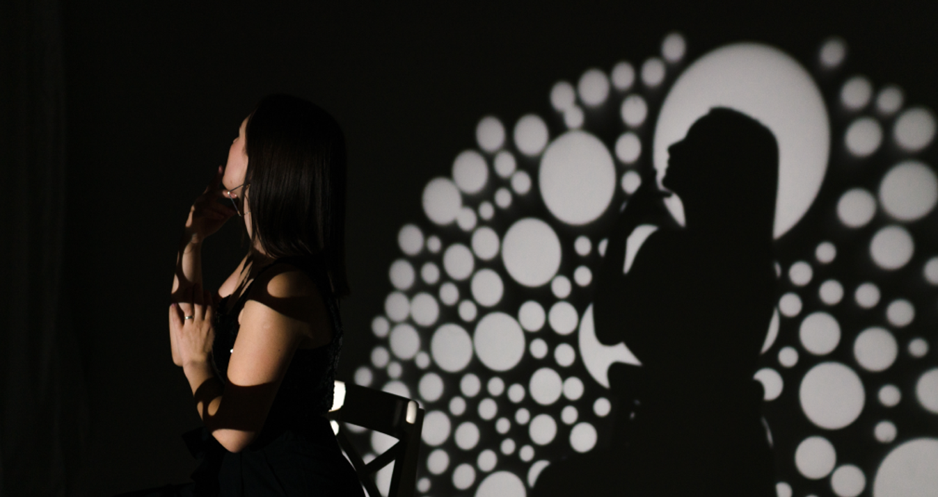
5. Conceptual Balance in Photography
Ideas carry weight, too — small figures versus vast landscapes, fragile details versus industrial scale, motion versus stillness. Set opposites in conversation, so the message feels poised, even when forms are uneven. During pre-visualization, pause to ask how your choices sustain photography as a hobby that rewards curiosity as much as craft. The next set will make these choices concrete through curated balance in photography examples.


How to Create Balance in Photography
Start by asking what emotion the scene should carry: calm or charged. Then place the strongest element where it serves that goal, and offer a counterpoint that steadies the frame. Small shifts in stance, focal length, or exposure often do more than big rearrangements, so keep testing angles and trimming distractions until the image sits.
Balancing Elements in Photography: Practical Tips
 Let's move on to specific advice. Good balance comes from a series of small decisions, not a single trick. Work the frame with intent, then refine.
Map visual weight: note what’s bright, saturated, sharp, or large.
Pair strength with relief: offset bold color with open space or a softer tone.
Simplify edges: crop or reframe to remove the pull you didn’t plan.
Use direction: lines and gestures should guide toward your subject, not away.
Match focus depth to intent: use shallower depth for a clear hierarchy, and deeper depth for shared importance.
As you practice, keep a lightweight workflow — shoot, review, tweak, repeat — so you keep your best variants safe and searchable with, say, best online photo storage woven into your routine. After a few sessions, you’ll read weight quickly and adjust without second-guessing.
Foreground vs Background Elements
 Depth changes how attention flows. A textured front layer can anchor the scene; a clean rear layer can calm it. Use the gap between them like a volume knob — more separation means stronger hierarchy, less separation means shared importance.
Choice | What changes | Typical effect | When to use |
Sharp foreground, soft background | Subject/near detail pops; rear recedes | Clear priority, fast read | Portraits, product, small subjects |
Soft foreground, sharp background | Near layer becomes a veil | Depth cue, gentle lead-in | Landscapes, street scenes |
Both crisp | Equal footing across planes | Rich detail, slower read | Architecture, documentary |
Foreground brighter than background | Front layer “heavier” | Pulls gaze forward | Close-ups, storytelling props |
Use this table as a planning checklist, not a script — change just one variable at a time, review, then commit.
Using the Rule of Thirds and Exceptions
 Thirds help you place weight off-center, so the frame feels poised rather than static. Put the subject near an intersection. Let a secondary element occupy the opposite third, and keep the horizon on a line. Break it on purpose when clarity or mood asks for it: center symmetry to stress order, push the subject deep into a corner to build tension, or split the frame 50–50 when reflection or duality is the point. The rule is a starting grid — once the hierarchy reads clearly, ignore the grid and serve the story.
Adjusting Visual Weight for Perfect Composition
Think like a scale. If one area feels too heavy, lighten it by reducing contrast, desaturating color, softening focus, shrinking shape, or adding negative space. If a key detail is too light, do the opposite — increase contrast, brighten, sharpen, or place a guiding line that pulls the eye toward it. Faces and text outweigh most elements, so treat them as anchors. Re-check edges for stray highlights, because small bright specks can tip the whole frame. When the gaze travels where you intend and returns to rest on the subject, you’ve reached a balanced, readable composition.


Post-Processing and Balance in Photography
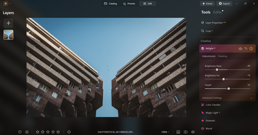
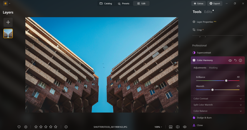
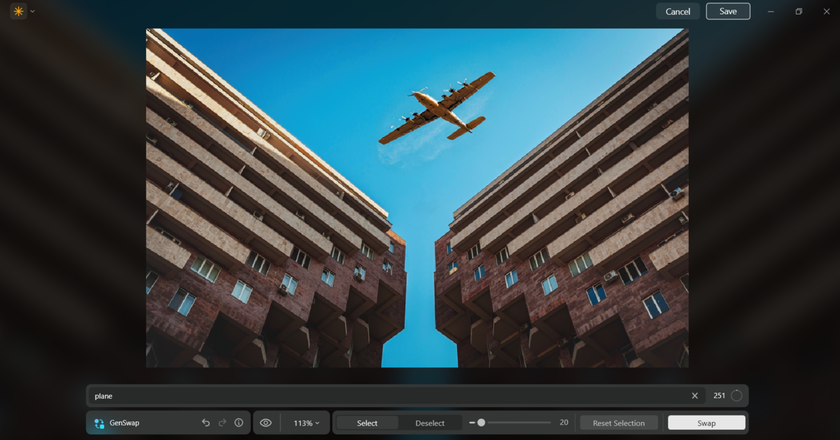
Luminar Neo gives you precise ways to steer the eye after the shot. For fast trials, work as you would in an AI image editor — create variants, compare, and keep only the version that reads effortlessly. Balance in photography continues to form after the shutter clicks. Editing defines how evenly the eye travels through the frame and where it finally settles.
The first step is controlling light. With Relight AI, brightness can be distributed more evenly, softening harsh spots and lifting darker areas without flattening depth. This keeps the contrast natural so that the subject feels integrated into the scene rather than isolated by excessive light or shadow.
Color adjustments then refine the frame’s emotional weight. Through Color Harmony, warm and cool areas are tuned to coexist instead of competing, while small corrections in saturation help quiet tones that distract from the main subject.
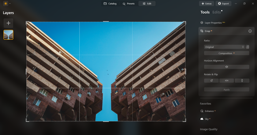
Composition tools such as Crop AI strengthen structure by redistributing visual weight: trimming a few pixels from one edge or shifting alignment can restore calm when the image feels tilted.
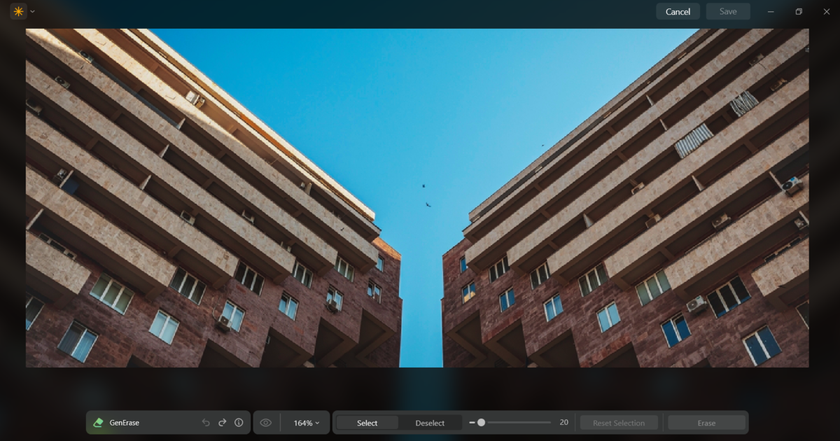
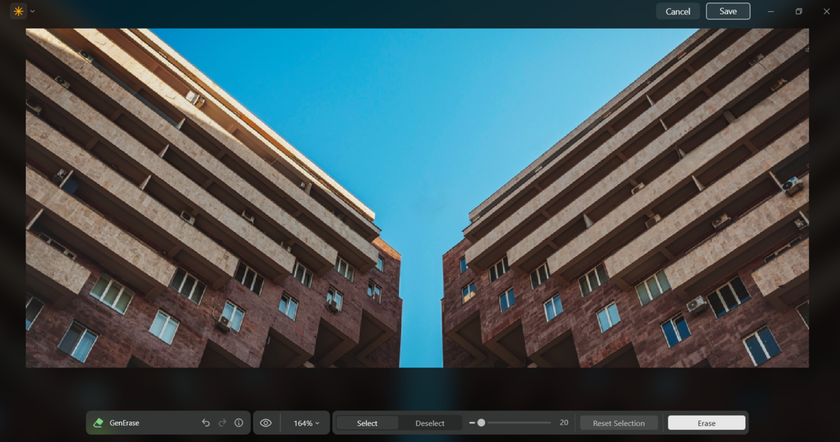
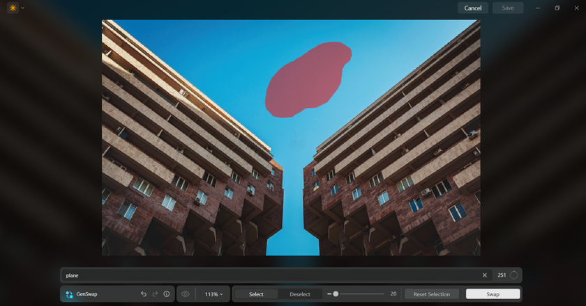
Finally, removing stray elements or filling missing areas with GenErase and GenExpand restores visual rhythm, allowing the frame to breathe. When brightness, color, and composition support one another, the viewer’s gaze moves smoothly and rests naturally — that is the moment true balance appears.


A quick full-view check — if the gaze travels smoothly and settles where intended — confirms that your edits elevated harmony without calling attention to themselves.
Unleash Your Creativity with Luminar Neo's Auto Photo Editor
Try it Now!Closing Frame: Where Your Eye Rests, Your Story Begins
Balance in photography makes an image feel deliberate. Throughout this guide, you mapped visual weight, chose between calm symmetry and charged asymmetry, tuned color and tone, and learned when to let opposites converse across the frame. The through-line is intent: decide what should matter first, then let every choice — placement, contrast, depth, negative space — serve that priority.
Small adjustments do the heavy lifting; a shift in stance, a quieter edge, a cleaner palette often turns a near-miss into a keeper. Post-processing refines, guiding the gaze without drawing attention to itself. If the viewer arrives where you intended and lingers, you’ve done the work. Keep practicing on everyday scenes, review often, and trust your edit to support your story. Master that loop and your photos will carry poise, clarity, and a voice that’s unmistakably yours.
FAQ
What Is Informal Balance in Photography?
Informal balance photography (asymmetrical) uses unequal elements that still feel harmonious — a strong off-center subject is steadied by lighter counterpoints like a leading line, a smaller shape, or open space.
What Are Examples of Balance in Photography?
Think of a centered building reflected in water, a portrait framed equally by doorways, a bright subject countered by darker open space, or a small figure balanced by a broad, softly toned landscape.
What Is Formal Balance in Photography?
Formal balance is symmetry: subjects and tones mirror across an axis, often with a centered placement, creating a calm, orderly, and timeless feel.
What Are Balancing Elements in Photography?
Balancing elements photography is a tool that offsets a dominant subject — lines, shapes, brightness, contrast, color accents, scale, texture, a secondary subject, or purposeful negative space — to keep the image from feeling lopsided.
What Is Balance in Photography?
Balance in photography is the distribution of visual weight, so that a picture feels stable and readable. It’s achieved by arranging subjects, tones, colors, and negative space, so attention moves naturally without one area overpowering the frame.