What Color Is Taupe: A Detailed Look At Its Characteristics
March 20, 2026

The color of mole fur, or what is gray-brown called and what photographers should do with it.
Do many photographers know the exact name of each color? Probably yes, but graphic designers and digital artists will definitely surpass them in this regard. What does the color taupe look like, and why should you care? If you are a photo or video retoucher or work with studios, stay tuned.
If a client comes to you with a request for "I want a photoshoot in this color scheme," you will already know what color it is and what it can be mixed with.
Don’t feel like reading the whole breakdown right now? Here’s a tighter, more practical summary of what actually changed.
Key Takeaways
Taupe’s origin and look: the name comes from “mole,” and the classic taupe read is a gray–brown with a subtle lilac/pink cast that makes it feel more “elevated” than flat gray.
Taupe is rarely truly neutral: it almost always leans pink-lilac, golden-sandy, olive, or gray (greige), so the same backdrop can look different across locations and lighting.
Fast undertone test: place your taupe sample next to a clean neutral gray and a warm ivory/white—you’ll immediately see whether it’s drifting pink, yellow, green, or cooler gray.
Closest “neighbors” matter: greige can make skin look ashy without warm accents; mushroom feels softer and more organic; putty needs texture to avoid looking flat; stone pushes the palette cooler and more architectural.
Why photographers use it: taupe is a workhorse neutral—it adds depth without harsh contrast, keeps backgrounds calm, and helps maintain cleaner skin tones under warm studio light.
Best use cases: in portraits, it reduces color bounce and keeps shadows natural; in fashion/lifestyle, it ties sets together through texture layering; in product, it reads premium but needs control for glossy reflections.
Most common mistakes: judging it under the wrong light (metamerism), choosing a taupe undertone that fights the model’s skin undertone, and mixing similar neutrals (greige/mushroom/stone) without a deliberate strategy.
The Color of Mole Fur
 This is exactly the same as its name in its original language. Of French and Latin origin, taupe literally means "mole," thus the hue of the fur of this ground-dwelling animal. Although moles tend to be black, it is due to this noble shade that they give off such charms.
A mole's pelt has a unique coloring—a mixture of gray and brown with an undertone of lilac. When talking about the color meaning of taupe, it is this little touch of lilac that separates taupe from a dead and simple gray.
Is Taupe a Warm or Cool Color?
 Taupe is rarely a 'true neutral'—it almost always leans one way or another, making it tricky to decide is taupe a warm or cool color without seeing it in your specific lighting.
Pink-lilac lean. If you have taupe that is beginning to look like "dusty rose" next to a neutral gray, you have a lilac undertone. This version looks outstandingly "expensive" and soft in combination with powders, creams, or dull plums. It can look muddy if you have it thrown next to yellowish beige.
Golden-sandy lean. If this starts looking a bit yellowish or sandy, it has a warm yellow undertone. It has honey cream, caramel, and light wood flavors best. Just watch what your white balance is—it's on a stiff cool white background, and by that, on a wide frame with a nice texture will make your frame accidentally "look yellowed" by this taupe.
Olive lean. You will be able to see this when this taupe appears "greenish" in the shadows. It looks perfect next to sage, eucalyptus, or warm grays. But try to take a pink nude and put it next to a pink nude, and you'll get a little weird feeling that it's kind of dissonance, that the pink is gonna start to look washed out or, more of a gray.
Gray lean (greige). This is evident when the taupe approaches a "greige" territory. It's a standby for the modern minimalist setup now, but it implies a trap. Without at least one warm accent (e.g., ivory, wood, or warm skin tones) in your photos, your skin may look unpleasantly cold and "ashy."
The simplest method of testing is by putting your sample (a backdrop, a prop, clothing) next to a clean, additive-free neutral gray and a warm ivory or white.
Your AI-Powered Photo Editor for MacOS and Windows
Discover Now!What Color is Taupe Closest to: Nearest “Neighbors”
Taupe is a complex mix of gray and brown, and many retouchers face the same question: what color is taupe closest to when matching backdrops? Its relative, Greige, is much easier to clean but can make skin appear cold without warm accents, while Mushroom provides a softer, organic, "beige-gray" effect for lifestyle shots.
Putty is a great example of a dense, matte neutral that highlights silhouettes that need the texture to be non-flat. If the tone is still indicating anything continued, you can always replace the color in image with Stone to create a cooler and more architectural crispness.
How to Use in Photo Shoots
 This particular variant of taupe adds a warm tinge of red to the frame. It has an organic feeling, which is why it's commonly used as a high-end neutral color in interior design and cosmetics. Taupe is much more likely to lean into violet or pinkish undertones rather than green. If you find these subtle shifts clashing with your lighting, the best move is to edit image colors during the retouching stage to keep those sophisticated pink hues under control.
Why a Photographer Needs Taupe
Taupe is a "workhorse neutral" that saves you hours in post-production. It gives a certain depth to the frame without using harsh contrasts. The background doesn't "scream" for attention, but it also never falls flat like a boring, cold gray patch of color.
Fewer headaches with white balance and the skin tones that maintain a clean look, even under the warm studio lights. When a client requests that "expensive, calm, and organic" look that does not require excess color noise, having a good taupe color definition in your color palette is a lifesaver. It also makes textures—think linen, wood, or a knitted brown blanket—pop with more volume and detail, provided you don't crush your shadows.
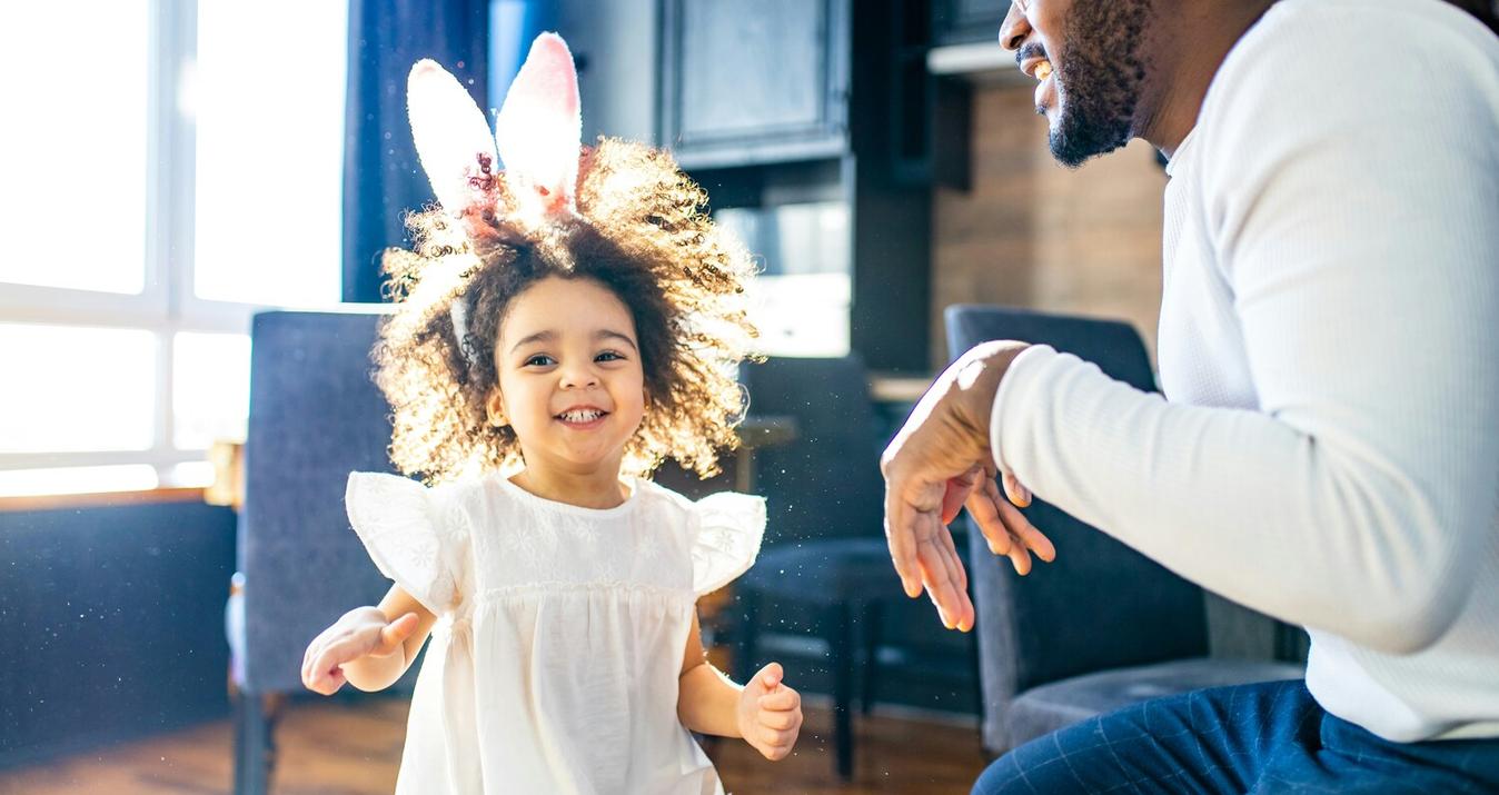
Taupe in Portrait Photography
 In portraiture, taupe acts like a soft "stress reliever" for skin tones. It doesn’t wash out the face like pure white can, nor does it bounce harsh, saturated colors back onto your subject. You might ask a common professional question: what color is taupe similar to in a studio setting, as it often acts like a refined cousin of greige that reveals its best side when paired with warm layers like cream or ivory.
This shade works wonders for the popular nude color outfits and makeup styles that clients often choose. It keeps skin-toned clothing from looking like a flat, washed-out blob, maintaining a delicate separation between the subject and the background. A quick pro tip: taupe is excellent for defining facial structures with side lighting because the shadows stay natural instead of turning "muddy gray." Just keep an eye on your exposure—taupe can quickly swallow up details in the midtones if you underexpose the shot.
Taupe in Fashion and Lifestyle
 In the fashion and lifestyle industry, taupe is a popular choice, since it makes it easy to coordinate wardrobe/prop sets. It allows the frame to appear both modern and upper class, especially when you are playing with different textures of the same tone - like a matte blazer and a satin dress, a wool, or a leather. This color serves as a perfect anchor for a series of photos, even though the subjects and locations may vary; taupe provides a cohesive and balanced look.
A good trick for your shot: if you can, try throwing in one lighter element, like an ivory or cream paint in on top of a deeper paint, such as mocha or dark taupe, and then you'll prevent an appearance of being "dusty." One technical detail to look out for is than taupe may easily go to green or pink under a mixed lighting condition. To prevent post-production debilitating headaches, you should try to fix your white balance to the main illuminating light source or consider a gray card to help keep you on a stable, professional series.
Taupe in Product Photography
 Taupe serves as a powerful background choice when you need a "premium neutral" rather than a sterile, white-on-white look. Cosmetics, ceramics, and high-end accessories naturally appear more expensive against this tone, as it adds depth to the shadows without washing out the product's form. While it complements matte surfaces perfectly, working with gloss requires precision: using a large diffuser in front and black flags on the sides will help you maintain clean, controlled reflection lines.
From a practical standpoint, if the product itself features warm neutrals like sand or caramel, taupe might cause the outlines to bleed together. To fix this, you should use a subtle rim light or a background layer that is either half a tone lighter or darker to create separation. This approach is highly efficient for catalog work; the background remains stable, product colors are rendered more accurately, and minor imperfections are far less noticeable than they would be on a clinical white backdrop.
3 Mistakes When Working with Taupe

Judging the Color Under the Wrong Light
Evaluating taupe by eye in one setting and shooting it in another is a recipe for disaster. This shade is notorious for metamerism; it might look like a warm gray-brown in natural light but suddenly shift toward a sickly yellow or green under 2700K studio lamps. If your props were picked under different bulbs, the shift can ruin your entire palette.
Picking the Wrong Undertone for the Model's Skin
You need to be precise when identifying what shade is taupe in your specific set, as it can lean toward dusty rose, yellow, or olive. Placing a model in pink-toned nude clothing against an olive-leaning taupe background will make their face look tired and ashy. This is a direct conflict of undertones, not a flaw in the color itself.
Mixing Similar Neutrals Without a Strategy
When considering what color is taupe similar to during prop selection, remember that Greige, Mushroom, and Stone all behave differently. Combining them randomly often creates a "dirty" look because their yellow, green, or cold gray bases clash. If you end up with conflicting tones in your frames, your only fix is to use a selective color editor to separate and balance those specific hues.
Final Words
Taupe is a trusted workhorse neutral since it remains composed on camera at the same time providing depth in terms of texture. When you determine its undertone, then you can tell how it is going to appear on skin, fabrics and the backgrounds when it is subjected to various light conditions. Be disciplined with the palette and select a single taupe family, which is paired with warm off-whites and contrast is not used but rather texture.