Pantone Color Of The Year 2024 Revealed
December 08, 2023

Let's research the latest Pantone news together and figure out how to use the Pantone color palette in your photography. Most importantly, we will reveal which hue became Pantone's color 2024. You will also learn how, with the help of Luminar Neo, you can easily change the shades of your photos, making them trendy.
Every year, the unveiling of the Pantone Color of the Year sets the tone for design, fashion, and creative industries worldwide. It's a moment eagerly anticipated by designers, trendsetters, and color enthusiasts alike. In 2024, Pantone chose a hue that embodies cozy charm and sophistication, setting the stage for a year of rich and inviting design possibilities.
What Is A Pantone?
A standardized color system is used worldwide to ensure consistency in color communication across many industries. And its name is Pantone Matching System (PMS). Think of it as a universal language for colors.
Here's how it works: Every hue in this system is assigned a unique code, making it easy to identify and replicate colors precisely. These codes are widely used in any design field (especially in fashion, printing, and manufacturing) to specify and reproduce hues accurately.
The Pantone system eliminates the confusion that can arise when different devices or software interpret hues differently. Instead of relying on vague color names, like "sky blue" or "forest green," which can vary widely, Pantone codes provide an exact reference point.
For example, if a designer in New York specifies a particular shade of red using a Pantone code, a printer in Tokyo can use the same principle to reproduce that exact shade, ensuring the color consistency of a brand's logo or product packaging across the globe.
A Pantone color palette is like a painter's collection of colors for the digital and design world. It's a set of carefully selected hues from the vast Pantone color system. Designers, artists, and creators use these palettes to maintain dye consistency in their projects.
Imagine you're decorating a room, and you pick a few favorite paint dyes. These become your hue palette for that space. Similarly, in design, a Pantone palette is a set of specific colors chosen for a project. It ensures that all the hues used in a design are harmonious and match perfectly.
Introducing The Color: Pantone Color Of The Year 2024
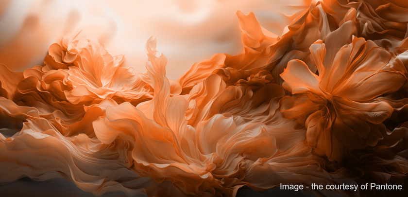
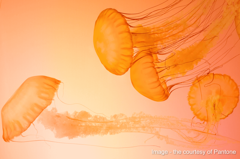
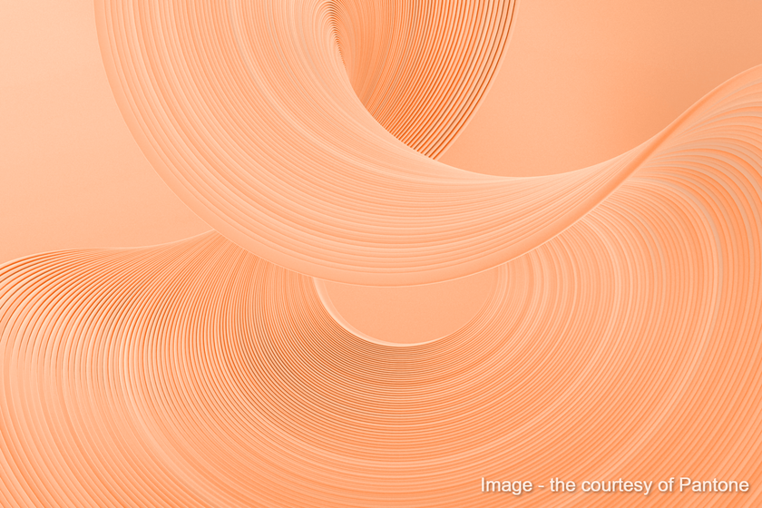
After many discussions of the WGSN color of the year 2024, the Pantone Color Institute has chosen Peach Fuzz as the dye of the year. In the Pantone color names system, it is designated as PANTONE 13-1023. This gentle and nurturing peach shade reminds us to slow down and care for ourselves and one another, reflecting the need for compassion and human connection in the year ahead. The romantic color's name evokes the tactile sensuality associated with the hue: it brings to mind velvety peaches, soft marabou feathers, and smooth vintage satins and silks, all in the subtle combination of pink and orange.
Pantone describes Peach Fuzz as gentle, warm, cozy, subtly sensual, and heartfelt, representing our desire to nurture ourselves and others. It embodies an all-embracing spirit that enriches mind, body, and soul, offering comfort and connection in a world of turmoil and uncertainty.
The Significance Of Peach Fuzz
Pantone's choice of Peach Fuzz for 2024 carries profound symbolism and meaning:
Cozy Vibe
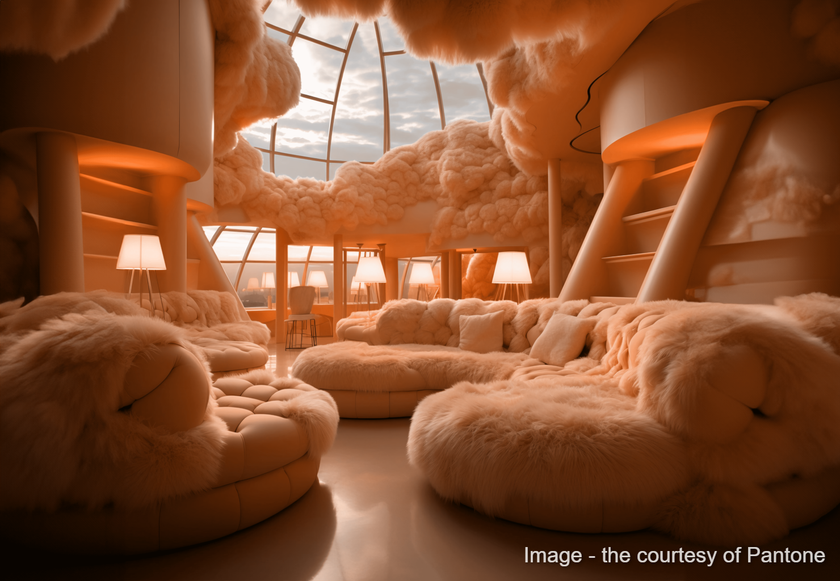
Peach Fuzz exudes a cozy vibe and tenderness, making it the perfect choice for creating inviting and soft spaces. Whether used in interior design, furniture, or home accessories, it wraps you in a delicate embrace.
Use it in your photography to create a soft, soothing atmosphere of ease and trust.
Sophistication
At the same time, Peach Fuzz exudes sophistication and elegance. Its hue adds a touch of lightness and refinement to fashion, beauty, and lifestyle products. Its light and translucent are a nod to the timeless allure of classic design.
Use it in your photography to add elegance and value to promotional merchandise, clothing, accessories, or portrait photos.
Versatility
Peach Fuzz's versatility shines in its ability to complement various colors. It pairs beautifully with gentle and deep shades of blue, offering endless possibilities for creative combinations.
Combine the background with the objects in the frame, the model's clothes, and various props to create a complete and harmonious picture.
Emotional Resonance
This hue resonates emotionally, representing a deep connection to the simple joys of life. It encourages us to slow down, appreciate the beauty in everyday moments, and find comfort in our surroundings.
Take advantage of the opportunity to use this emotion in photography.
Incorporating Peach Fuzz in Design
Designers and creators across industries will find endless opportunities to incorporate Peach Fuzz into their projects in 2024:
Interior Design
Use Peach Fuzz for accent walls, upholstery, or home accessories to create cozy and inviting living spaces. Pair it with deep contrasting colors like blue, green, or purple for a harmonious balance.
Fashion
Peach Fuzz is a tenderness in choice for clothing and accessories. It adds a touch of softness to eveningwear, suits, and handbags. Peach Fuzz-colored scarves, gloves, or shoes can refresh any outfit.
Graphic Design
Peach Fuzz can convey a sense of sophistication and timelessness in graphic design and branding. It's an excellent choice for backgrounds, packaging, and marketing materials.
Art and Creativity
Artists and creatives can use Peach Fuzz as a base color to evoke emotions and create captivating compositions. Its dye draws the viewer in and tells a gentle story.
Home Decor
From cushions and throws to rugs and drapes, Peach Fuzz can be introduced into home decor elements to add a touch of freshness, space, air, and warmth to any room.
Advanced yet easy-to-use photo editor
Get Luminar Neo NowCreate Trendy Photos Using The Pantone Color Palette
It is important to follow trends in photography, as in any other creative field. The color — this is one of the main elements of any image. Even if you do not follow Pantone news, from this article, you know that one dye is chosen yearly, and many industries use it as the basis of their products. Photographers also often follow this trend.
We already know which shade will be trendy in 2024. Now, let's find out how we can use it in photography. The Pantone palette is like a magic wand for photographers and designers. It's a collection of carefully chosen colors that can turn your photos into trendy and eye-catching works of art.
Here's how to use the Pantone palette to create trendy photos:
Step 1. Start With A Vision
Before you edit your photos, have a vision in mind. What mood or vibe do you want to convey? Do you want your image to feel cozy and warm or cool and modern? Having a clear vision will guide your dye choices.
Step 2. Select Pantone Colors
Look through the Pantone color palette and choose dyes that fit your vision. Whether you want to add a pop of color to your subject or create a harmonious background, Pantone colors offer a wide range of options.
Step 3. Editing Tools
Use photo editing tools like Luminar NEO to apply the selected Pantone colors to your photos. You can adjust the saturation, hue, and brightness to achieve the desired look.
For example, with the help of Luminar Neo’s Picture Color Changer, you will get an amazing shade transformation in a couple of seconds. You can easily convey the desired atmosphere, even if the original photo had different shades. And with the help of various functions of Luminar AI, you can reach a new level of color correction.
Step 4. Color Balance
Maintain a balance between the Pantone and existing dyes in your photo. It ensures the new colors integrate seamlessly and don't overwhelm the composition.
Step 5. Experiment
Be bold and experiment with different Pantone color combinations. Try various shades and tones to see what works best for your photo. Sometimes, unexpected hue choices can lead to stunning results.
Step 6. Enhance The Mood
Pantone colors can evoke emotions. Use them strategically to enhance the mood of your photo. For example, warm dyes can make a photo feel cozy, while cool hues create a serene atmosphere.
Step 7. Print And Share
Once you're satisfied with your trendy photo, consider printing it to see how the Pantone colors translate in the physical world. You can also share your work on social media or use it in design projects to stay on-trend.
Explore the Power of AI with Luminar Neo
Try it for free!Bottom Line
Pantone is a standardized color system with unique codes that help people in various industries communicate and reproduce dyes accurately, promoting consistency and eliminating color guesswork. It's an essential tool for anyone working with colors, ensuring that what you see on your screen matches what you get in print or production.
Pantone color palette is especially useful for branding, where dyes must be consistent across logos, websites, and marketing materials. With it, you can be sure your chosen shadows will look the same wherever they're used, creating a unified and professional appearance.
The extensive dye library includes thousands of Pantone color names, making it a valuable tool for maintaining hue consistency and achieving desired visual effects in design and production processes.
Incorporating Pantone colors into your photo editing process can breathe new life into your work and keep it fresh and stylish. Whether you're a photographer, graphic designer, or someone who loves creating beautiful visuals, the Pantone palette is a valuable tool for staying trendy and making your photos stand out. Experiment with the new trend of 2024 — Peach Fuzz; get inspired by this shade in other industries and integrate it into your shots. And use Luminar Neo as a dedicated assistant in creating a Peach Fuzz mood.

